

Introduction
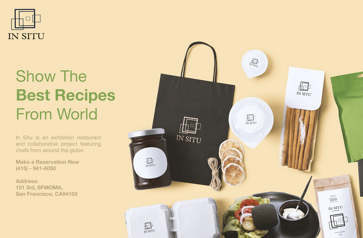
In Situ is an exhibition restaurant and collaborative project featuring chefs from around the globe founded by Chef Corey Lee.
This project is an individual creative redesign project with a 4-month process to design a new logo, business card, some merchandise, and collateral. Also, the project came with a redesigned website and an in-store E-menu.
Project Type
Individual school project
My Role
Redesign branding
Redesign website
Create an E-menu
Tools
Figma, Illustrator, Photoshop
Timeline
4-month
(2/5/2019 - 5/1/2019)


Research and Analysis
Understanding the design constraints.
Competitive Analysis
Before jumping into the design, I want to see other competitor restaurants’ websites and find out what are the strength and weaknesses they have.

In Situ’s current website:
- Theme colors: gold and white.
- Logo: Artistic and modern font with dark brown color.
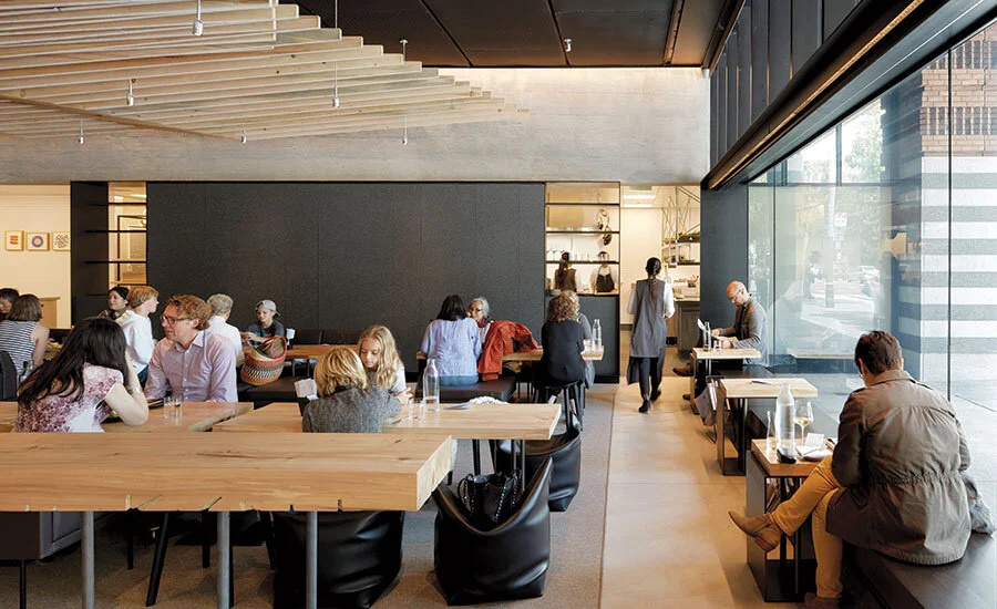
- Luxury and exclusivity interior design
(table, chair, lighting, server credenza, lounge)
- Animations on the home page.

🍲 Rich Table
Clean and simple layout and design elements to convey the feel of its surrounding that is modern, convivial, and comfortable.
- Theme colors: Red and black.
- Logo: Square with round edges and simple text.

🥞 State Bird Provisions
Urban-rustic storefront setting for a changing menu of American small plates served dim-sum style.
- Theme colors: White, brown, red, and green.
- Logo: Handwriting style font with a white outline with a hollow inside.
- High-quality cooking
Target Market
It is a corporate-run enterprise. The restaurant 🥘 is located in SFMOMA which is a modern and contemporary art museum located in San Francisco, California.)
Income
Middle to high-income level 💰
Interests
Most customers come to visit the museum, while others come for the indoor art atmosphere of the restaurant. 🖼️
Gender
All gender
LGBT community 🏳️🌈
Occupation
Customers are mostly from the art and technology fields. They are tourists and locals.
🎨 & 🖥️

Graphic Design
Logo, Colors, Font
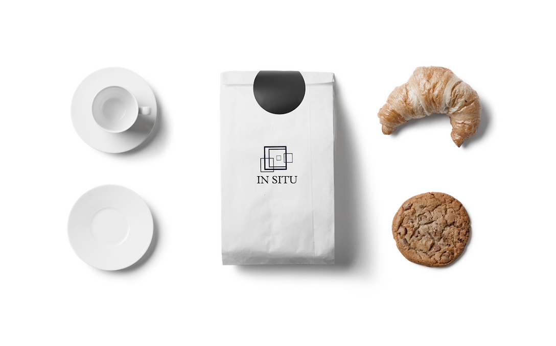
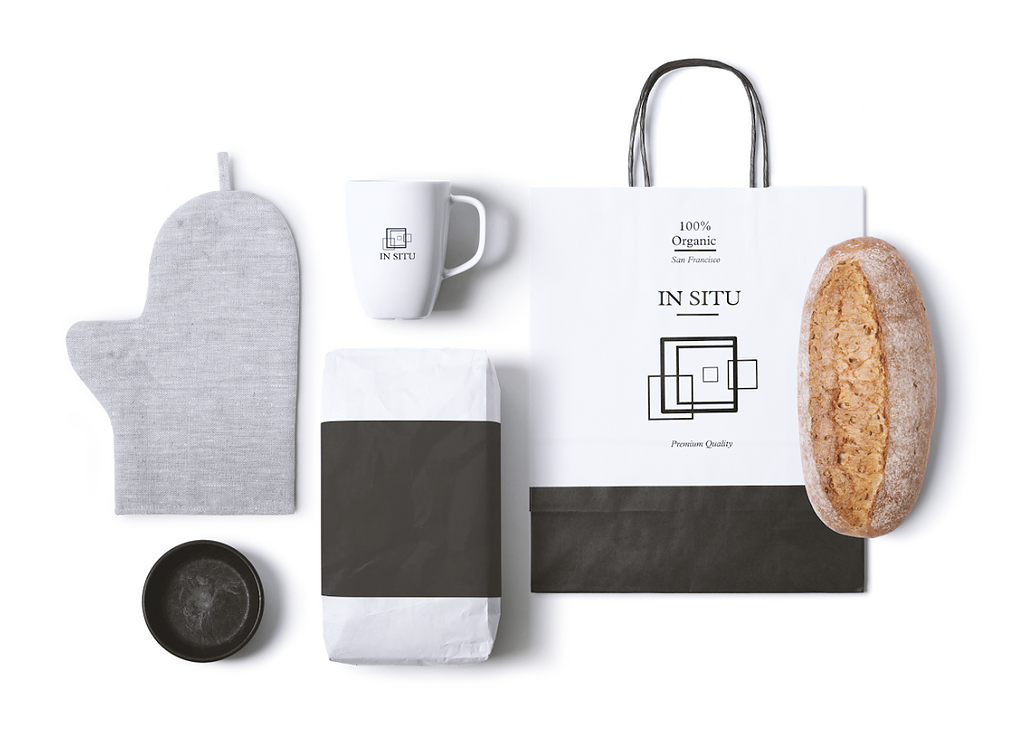
Color Palette
In order to keep the restaurant with its usual premium feel and echo the interior design, I chose golden brown, black, and white as the main colors of the design.
Also, we have a lot of customers who like art, so I used vibrant green to give the design character and vibrancy.
This color scheme keeps the mystery and also makes customers appetite.

Font
I chose the font for the logo and the title is Plantin MT; for the body is Helvetica.
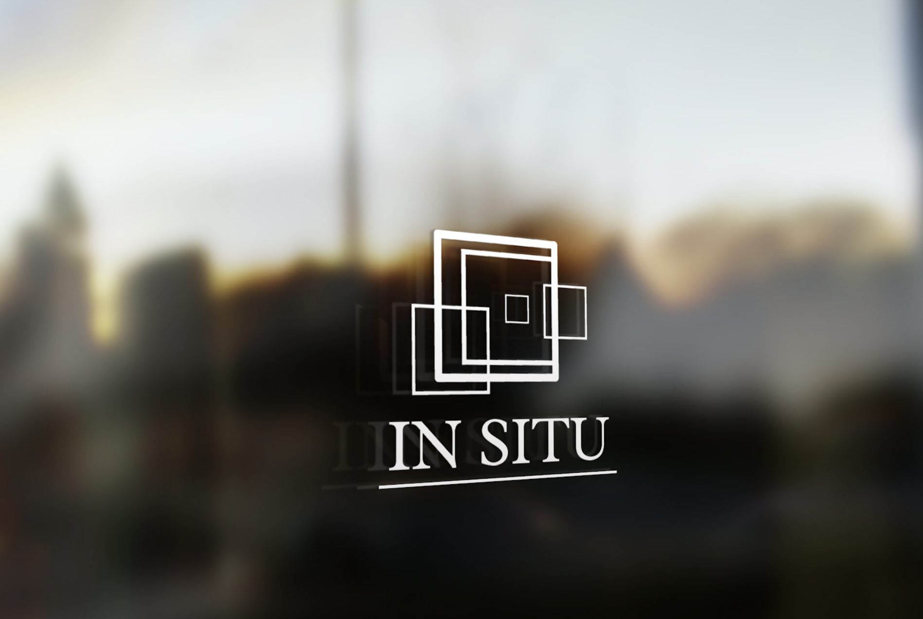
Logo Design

The logo design is inspired by a group of lyrical, graphically engaging gouache paintings on the wall inside the restaurant.
Logo Mockup


Stationery Design


Advertising
Advertising - Anywhere
Advertising and marketing are an integral part of restaurant development.
I designed a number of posters that were placed on different platforms, such as websites, streets, bus stops, magazines, and so on.


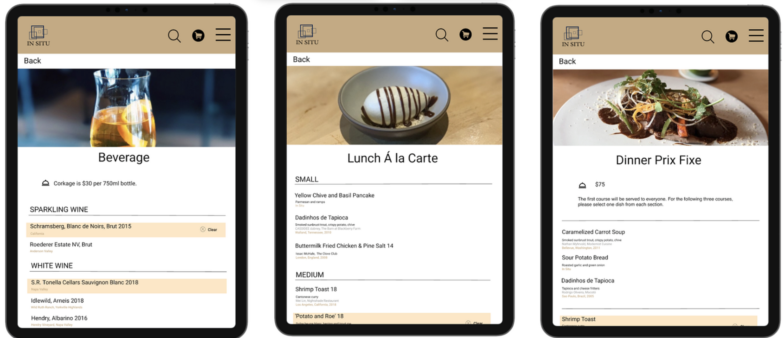
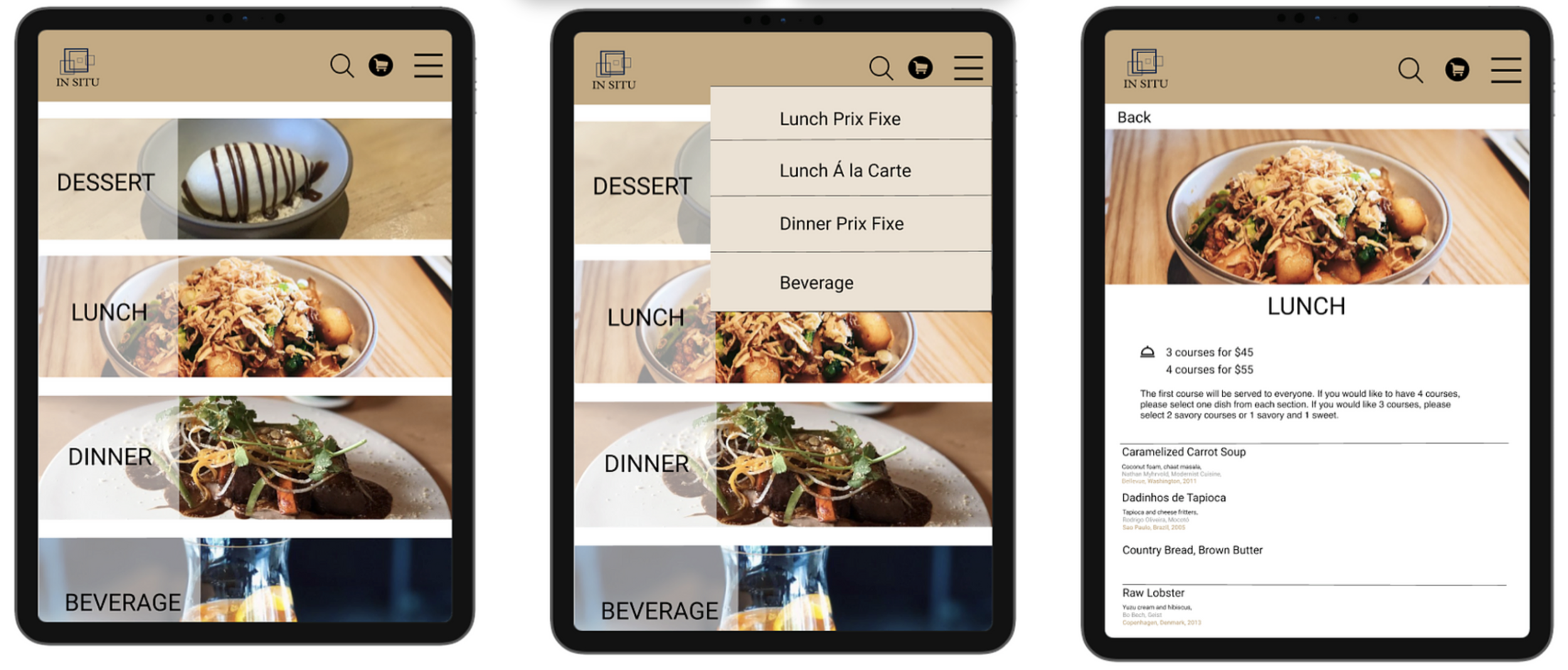
Website
Link to PDF
Site Map
I generated a site map to make sure I stayed focused on the features and screens that were essential to the website, understand the architecture, and ensure that the navigation is structured intuitively for users.

